
Another Earth (2011)
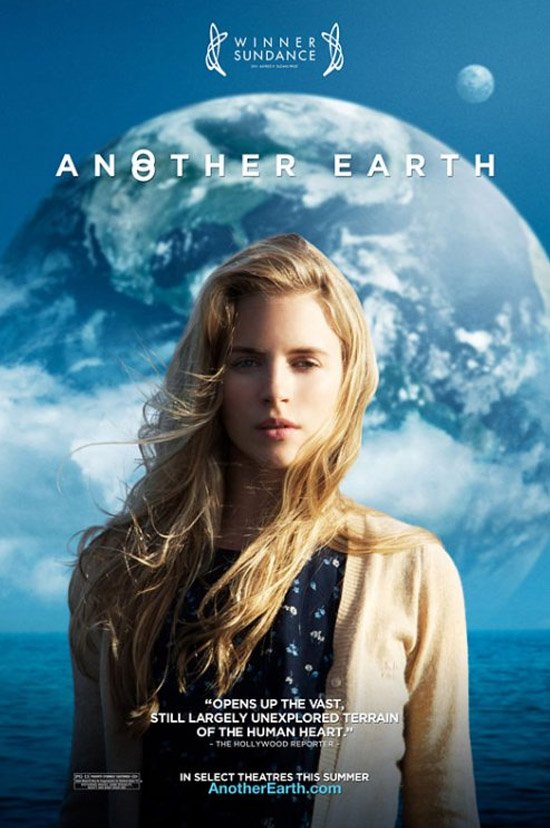
Another Earth is an indie sci-fi film about another Earth appearing in the sky. This event is explored through the character of Rhoda who is seen on the poster. The narrative told in the film uses this event as a backdrop to tell a much more human and tragic story which is reflected on this poster.
While Another Earth is a feature, I consider it to be very similar to many short films as it is primarily about two characters and their relationship and doesn't answer every question the audience would have about the new planet. This poster reflects this as it includes the protagonist (played by an unknown, attractive actress) as its main focus with the sci-fi background rooting it in genre.
It is a very simplistic poster, with no credits to director, actors/actresses or companies which is due to its position as an indie film and likely a debut film for the director and cast. To attract its audience (which wouldn't be very mainstream due to its unconventional storytelling choices) it announces its winning of the Sundance Film Festival - a very popular festival for premiering of films in search of distributors. This victory would attract an audience who enjoy films that are good.
Also furthering its simplistic appearance is a very basic colour scheme which consists of mainly blue and whites. Whereas many blockbuster/mainstream movies use garish, bright colours (pretty often blue and orange) to scream for an audience's attention amongst the other loud, bright movie posters, any audience that would see this film would be paying attention to the poster in the first place and likely want to see it for the fact it isn't a loud, bright movie and promises something more thought provoking.
What I would be likely to take away from this poster is it's ability to convey the nature of the story in such a simple way, using a very basic colourscheme and imagery.

Paperman (2013)
Paperman was a Disney short film shown to audiences before Wreck It Ralph, a feature film. It's an animated film which returns to Disney's 'traditional' 2D animation with a few updated innovations. The film is entirely in black and white - save for the red lipstick seen on the paper airplane.
Like Another Earth, Paperman focuses on a simplistic image. Paperman doesn't explore its characters as much as Another Earth did which is why the main character isn't shown prominently. It's about what happens to the characters; not who they are.
The famous Disney logo is the only text (aside from the title) on the poster. Disney is an acclaimed studio and including its name guarantees an audience.
What I could take away from this poster is that it isn't necessary to feature your actor prominently on the poster. Although Paperman is an animation, it's likely that the actor who plays the main character wouldn't be seen on the poster anymore than this one: ultimately it depends on the film.

Robot & Frank (2012)
The first thing that strikes me when I look at this poster is that it looks like a romantic comedy yet also completely different. Posters for rom-coms are almost entirely composed of a colour scheme that features reds and whites - the choice here to use yellow makes the poster stand out yet seem familiar.
The plot of Robot & Frank is akin to a romance comedy in some respects - two characters, very different, learn to love each other as they get to know each other. The film soon gets very more unconventional but the initial root in familiarity 'prepares' the audience for what to expect.
Unlike the other posters, the actors names are featured prominently here. While none of the cast would be able to draw an audience in on their own merits, the combination of "That guy from X-Men" and "The girl from Armageddon" would also help root the audience in familiarity.
The main character - Frank - is played by an unknown actor. The quoted review would help ease any potential audience that may be on the fence about seeing a movie starring an actor who may be awful. The review praises the actor's ability and with the Sundance credit marks the movie as something distinctive.
This is undeniably a poster for a feature film with a larger cast than a short film could deal with however the initial, primary image of Frank and his Robot is brilliant in it's simplicity, with the yellow bringing a focus to that.
No comments:
Post a Comment