As ideas for a short film go there are many I could choose from. I have been making an effort to watch a video on Short of the Week every day for a few months now to work out myself what works well and what doesn't. Some of favourites I have found are:
Do You Believe in the Devil?
A horror that plays with the faustian bargain trope. I like this one because it is brilliantly written but also beautifully shot and edited.
The Black Hole
The best short films are the ones that focus on an idea and leaves you asking questions. This one certainly does and manages to do so without using any dialogue.
We Were Awesome
A seven minute dialogue between two friends which manages to reveal so much more about the two characters' relationship. The story also revolves around a single, beautiful visual which the audience ends up anticipating as much as the characters.

Monday, 30 June 2014
Sunday, 29 June 2014
Similiar Product Research - Posters
One of the tasks I will need to complete is creating a poster for my short film. To do this I am looking at other posters that are likely to be similar (in tone and style) to the one I will create.
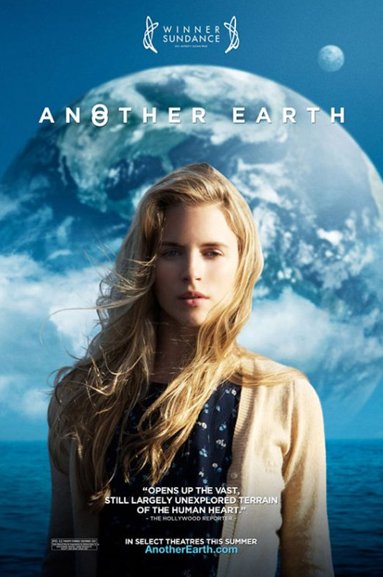


Another Earth (2011)
Another Earth is an indie sci-fi film about another Earth appearing in the sky. This event is explored through the character of Rhoda who is seen on the poster. The narrative told in the film uses this event as a backdrop to tell a much more human and tragic story which is reflected on this poster.
While Another Earth is a feature, I consider it to be very similar to many short films as it is primarily about two characters and their relationship and doesn't answer every question the audience would have about the new planet. This poster reflects this as it includes the protagonist (played by an unknown, attractive actress) as its main focus with the sci-fi background rooting it in genre.
It is a very simplistic poster, with no credits to director, actors/actresses or companies which is due to its position as an indie film and likely a debut film for the director and cast. To attract its audience (which wouldn't be very mainstream due to its unconventional storytelling choices) it announces its winning of the Sundance Film Festival - a very popular festival for premiering of films in search of distributors. This victory would attract an audience who enjoy films that are good.
Also furthering its simplistic appearance is a very basic colour scheme which consists of mainly blue and whites. Whereas many blockbuster/mainstream movies use garish, bright colours (pretty often blue and orange) to scream for an audience's attention amongst the other loud, bright movie posters, any audience that would see this film would be paying attention to the poster in the first place and likely want to see it for the fact it isn't a loud, bright movie and promises something more thought provoking.
What I would be likely to take away from this poster is it's ability to convey the nature of the story in such a simple way, using a very basic colourscheme and imagery.
Paperman (2013)
Paperman was a Disney short film shown to audiences before Wreck It Ralph, a feature film. It's an animated film which returns to Disney's 'traditional' 2D animation with a few updated innovations. The film is entirely in black and white - save for the red lipstick seen on the paper airplane.
Like Another Earth, Paperman focuses on a simplistic image. Paperman doesn't explore its characters as much as Another Earth did which is why the main character isn't shown prominently. It's about what happens to the characters; not who they are.
The famous Disney logo is the only text (aside from the title) on the poster. Disney is an acclaimed studio and including its name guarantees an audience.
What I could take away from this poster is that it isn't necessary to feature your actor prominently on the poster. Although Paperman is an animation, it's likely that the actor who plays the main character wouldn't be seen on the poster anymore than this one: ultimately it depends on the film.
Robot & Frank (2012)
The first thing that strikes me when I look at this poster is that it looks like a romantic comedy yet also completely different. Posters for rom-coms are almost entirely composed of a colour scheme that features reds and whites - the choice here to use yellow makes the poster stand out yet seem familiar.
The plot of Robot & Frank is akin to a romance comedy in some respects - two characters, very different, learn to love each other as they get to know each other. The film soon gets very more unconventional but the initial root in familiarity 'prepares' the audience for what to expect.
Unlike the other posters, the actors names are featured prominently here. While none of the cast would be able to draw an audience in on their own merits, the combination of "That guy from X-Men" and "The girl from Armageddon" would also help root the audience in familiarity.
The main character - Frank - is played by an unknown actor. The quoted review would help ease any potential audience that may be on the fence about seeing a movie starring an actor who may be awful. The review praises the actor's ability and with the Sundance credit marks the movie as something distinctive.
This is undeniably a poster for a feature film with a larger cast than a short film could deal with however the initial, primary image of Frank and his Robot is brilliant in it's simplicity, with the yellow bringing a focus to that.
Saturday, 28 June 2014
Similar Product Research - Main Task
Eager to understand what it is in a film that makes it significant and covey meaning, I looked to what some have considered one of the greatest movies of all time - certainly one of the most significant ones for the genre. Knowing how meaning is conveyed will help embed meaning in my own video.
Thursday, 26 June 2014
Ciaran Davis - ‘The Huge Snooze’ Exploration
To make the best possible short film, it is necessary to see
what has come before to develop knowledge of the medium - You have to be able
to know the rules before you can be break them.
I’m looking at a previous piece of coursework - a short film
called ‘The Huge Snooze’.
The film comes across as an authentic homage and ribbing of
the film noir genre as it plays with the tropes of the ‘femme fatale’ and the
sleazy private detective.
Opening with a beautifully appropriate soundtrack and title
card, the film’s progression into opening credits reminiscent of those included
at the start of many film noir movies the viewer could be fooled into believing
this is simply another entry in the genre.
However, by the time the protagonist
declares proudly that he is ‘a dick’ the humour and affection for the genre is
seen.
This is continued with the visuals. The atmospheric opening
shot of Mr Mallow lighting a cigarette surrounded by darkness sets a precedent for
the rest of the film which thankfully is consistent.
While there does seem to be a necessity to accommodate the
pre-written monologue - with a few shots that linger a little too long while
the narrator describes what he and the viewers can see - the humour is ever
present lighting the noir tone.
With great lighting, set design and cinematography The Huge
Snooze fits comfortably amongst other film noir movies.

Looking at his ancillary tasks, what I appreciate most is
the acceptance (and embracement) of the film’s existence as a short film with
no attempt of presenting it as a feature. I would consider that to be a fallacy
as the distribution and viewing of short films is completely different to
features.
This is why Ciaran has chosen one of his reviews on his
poster to be by Sight and Sound as opposed to Empire which would not regularly
review a short film.
The main focus on the poster is a still from the short film
which has been edited slightly. The visual of a man looking through a window surprised
fits in well with the film noir genre and definitely would encourage someone
who saw it to enquire more. The use of a single frame as the main image is
likely something I will do for my poster too.
The review page looks effective as if it was from a
magazine. The choice to focus on the actor’s career as opposed to a review presents
it as a film that already has a presence in the reader’s mind, with the writer
referencing made up events to create that illusion.
Looking at the work Ciaran has done for his Media Coursework
has definitely helped me put thought and consideration into making a high-quality
short film with accompanying tasks that appear genuine and consistent.
Tuesday, 24 June 2014
Production Diary - Introduction to the Course
The Coursework for A2 Media Studies focuses on producing a piece of Media. We have been given a series of briefs which outline the different types we can do - these vary from a music video to pages of a newspaper - and they are all very exciting.
The one I am going to complete this year is the creation of a short film in its entirety. I love the medium of film and earlier in this year took part in a screenwriting course run by the BFI based in Newcastle upon Tyne where the participants were guided in the development of a five page script for a short film which I really enjoyed and I'm looking forwards to doing this as part of my A2 course. Learning how to shoot and edit the video is also something I'm excited about learning to do.
What would come with this is creating a poster to promote the film, a radio trailer for the film and a page in a film magazine featuring a review. These tasks are also something I'm looking forwards to doing. An upcoming post will focus on analysis of posters that are similar to my film - a mix of feature films with a similar tone to something I might create and other short films. A radio trailer would be interesting as film is such a visual medium to strip a vital part of the product and still trying to promote it will be a challenge. I listen to a lot of Audio Plays so I have a bit of knowledge of what will and won't work on radio.
The development of my short film and the other tasks will be chronicled on this blog from start to finish and I can't wait to see the end result.
Subscribe to:
Posts (Atom)